2020's dual crises showcase the new role of "big data" in journalism
The pandemic-and-election year prompted major news organizations to invest big time in data-based journalism and reader engagement
Most news organizations, especially local ones, don’t have the money to invest in creating and curating large databases of information about current events, or in professional analysts, writers and graphic designers to portray that information to readers in appealing ways.
But a few do. In 2020, a year of dramatic news about the coronavirus pandemic and a volatile presidential election, major media organizations have used data-based journalism tools in the most creative and informative ways. I’m in awe of some of the results in 2020, so I’m saluting a few of the best examples I’ve seen. (Some of you might be less fascinated by this subject than me, but…)
Sometimes, it’s just a simple, clear illustration of data that makes readers instantly understand, such as this Washington Post dramatization of the effectiveness of one of the first coronavirus vaccines. It’s not the words, but the visualization which produces quick understanding.
Since the start of the coronavirus pandemic in early 2020, scientists at a lot of universities and healthcare institutions have been collecting data about infections, deaths, hospitalizations and other aspects of the crisis. Johns Hopkins University was among the first to create a comprehensive visual display of the pandemic. Their pandemic map shows county boundaries, but not state outlines. It includes some major cities to help viewers make sense of the data. When you visit the site “live” online (you can try it here), it’s possible to zoom in interactively for more detail, but you’ll see the site is designed for people using large screen computers, because the maps are surrounded by a rich (but cluttered) array of controls and other data links.
Data visualization specialists have built still images and animations (like this one, below) which almost seem magical in clarifying national and global trends of COVID-19. Transforming “numbers” into “understanding” is what I’m trying to highlight. Here’s another Johns Hopkins example: they visualize the pandemic’s progress with new animations every day.
News organizations (distinct from hospitals and medical research organizations) generally try to add value to the data by creating visualizations more immediately comprehensible to ordinary consumers. The Times, for instance, gathers data from the same state and local agencies as Johns Hopkins does, then overlays geographic and political information such as state and county boundaries or voting data to reveal whether the pandemic is spreading differently. This COVID-19 per capita map is one of many that news organizations have used to reflect the changing pandemic since early 2020. This map uses the same data as the Johns Hopkins map above, but the Times’ visualizers have cleared away county-boundary underbrush, while overlaying state boundaries, a more user-friendly portrayal. This map, too, is interactive (try it here).
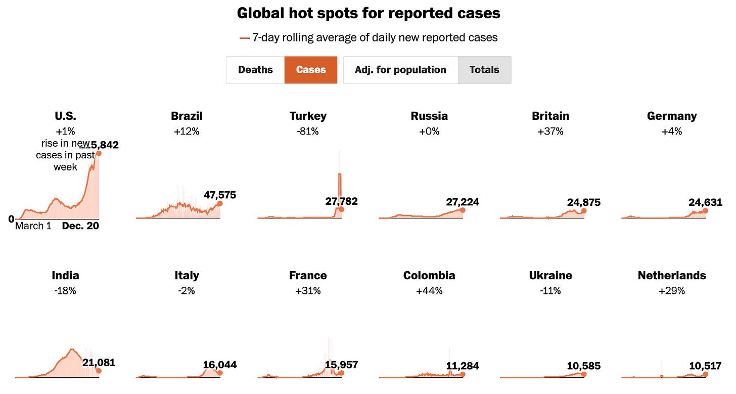
The Washington Post uses a different visual technique to show the global pandemic picture, allowing readers to compare the U.S. with other global hotspots.
News organizations have created visualizations to illustrate everything from the weather’s impact on COVID-19 to the number of hospital intensive care beds occupied in every corner of the country. They’ve also visualized the pandemic against holiday season travel for Thanksgiving, and have made maps of COVID cases, COVID-related deaths, worldwide “hotspots,” local success stories and many other aspects of the pandemic.
A footnote about the COVID-19 data gathering: In another time, such massive arrays of public health data might have been expected to be collected and dispensed by the federal agencies, which regulate the hospitals collecting it. But during the Trump administration, major news organizations and university researchers decided to gather, store and curate the data themselves. My personal opinion is they feared the federal government might tinker with the public data – or restrict it altogether – to prevent media from reporting the true extent of the pandemic. That’s why you’ll see constant attribution to pandemic databases “maintained” by the news organizations themselves, rather than any federal agency. This level of data management by news organizations is unusual, and expensive. But, in 2020, I think it’s been indispensible to tracking the pandemic by those who never thought COVID-19 was a “hoax” perpetrated by “fake news” media.
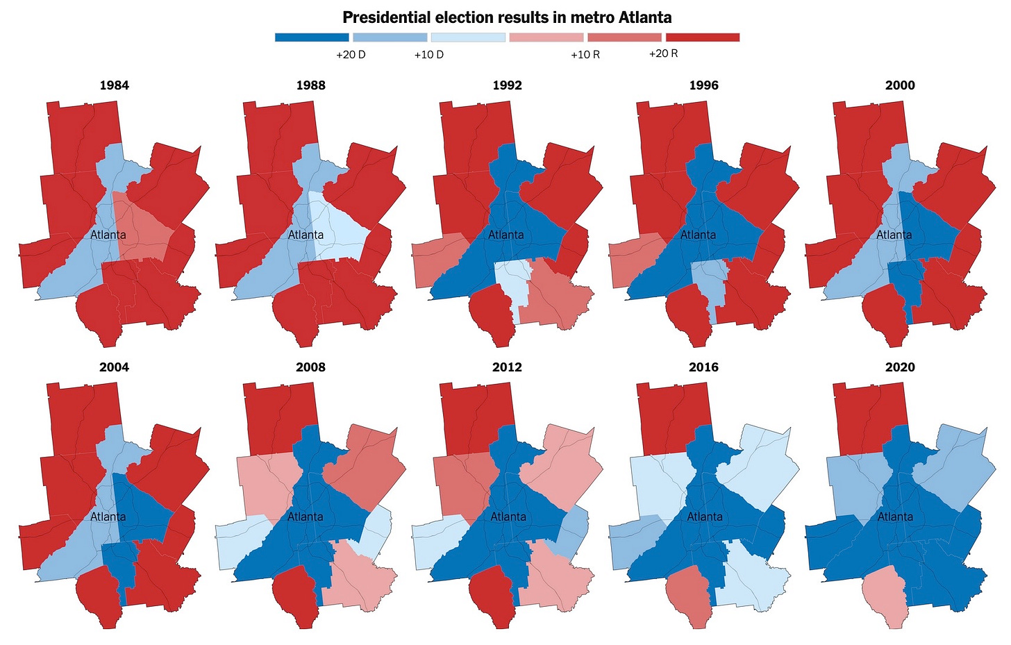
Sometimes, telling an historical story can be dramatized visually with maps based on years of political voting data. Readers don’t need to see the data - in fact, most people would be bored by all the rows and columns of information used in these news reports, but the resulting illustrations make for instant understanding of trends over time. Here’s the New York Times’ analysis of a quarter century of political change in the Atlanta metropolitan area, culminating in Georgia becoming a “blue” state for the first time in decades.
What’s important to realize is that these bright, clear maps are not just artistic drawings. They are computer-generated graphics created from millions of voting records from ten U.S. presidential elections over three decades. And not just statewide data, but precinct-by-precinct information, allowing journalists and political analysts to “see” into virtually every corner of the country and to watch political trends unfold.
About a month earlier, the Times had gathered all the 2020 voting data for Georgia (not just the Atlanta area) and combined it with similar data from the 2016 presidential election to illustrate Georgia’s historic shift from Trump to Biden in just four years. In the first map below, the 2020 results show that Trump won by big margins in mostly rural areas of Georgia.
This second map shows where changes in voting patterns occurred between 2016 and 2020.
It’s no easy feat to create news illustrations like this. Teams of political analysts must decide which data are important to tell the story. Data-mining experts delve into voting records to extract what’s needed. Computer illustrators use sophisticated tools (in this case, something called “Mapbox,” which creates maps based on compiled data) to portray the raw numbers visually. Editors review the work to be sure elements like colors and legends make the story instantly comprehensible to people who are not political scientists.
In 2009, I took a class of University of Delaware students to the Times headquarters in New York City. Among other things, we saw what was then a new rearrangement of the Times’ newsroom. For the first time, reporters and writers were physically grouped together with editors and digital design specialists. Those teams could develop a news report collaboratively. Writers and reporters came up with the basic themes and crafted the words of the story. Editors massaged the words, checked facts and worked on headlines. At the same time, the digital staffers conceived of stunning visual ways to illustrate the story.
If the collaboration was especially successful, the entire “package” would be elevated by the Times’ editors to prominence on the newspaper’s website and digital feeds… and even in the print edition… all because the total package turned out to be more impactful than its component parts.
Details of graphic representation may seem insignificant to news consumers, but they can be very powerful. I recommend visiting this interactive discussion of political map design, also from the New York Times. Merely choosing colors to represent Trump’s electoral college victory in 2016 can make a huge difference in consumers’ perceptions about political polarization in the United States. Just compare these two maps of the same voting data from 2016.
In the map above, even states with mixed political voting trends are starkly colored in the same bright red and blue. In the map below, depicting the same information, computers are instructed to shade, or blend, the reds and blues not according to state-wide results, but based on county or precinct data. The country looks more purple than blue or red, more accurately portraying the blend of political voting in 2016. It looks less polarized than in the map above. (There are other options, too, which you’ll see if you visit the online discussion.)
Because the COVID-19 pandemic ravaging the world coincided with the dramatic finale of the Trump administration in a presidential campaign year, news organizations with the financial resources to do it had a field day with “big data.” I won’t be surprised if journalism prizes are awarded to the Times and a few others highlighting their extensive and creative portrayals of both the pandemic and the election campaign in 2020. The sad thing is: smaller news organizations generally can’t afford to collect and maintain data like this, even for just their own states, nor afford to hire the kind of analysts and computer graphic design staffs needed to produce such striking and engaging visualizations of the news.
On that note (I know this is a long post), I bid you all a happy holiday break – or at least as happy as possible under the cloud of the COVID-19 inferno of this winter.
Be well. Stay safe. Take care of yourselves and protect others.


