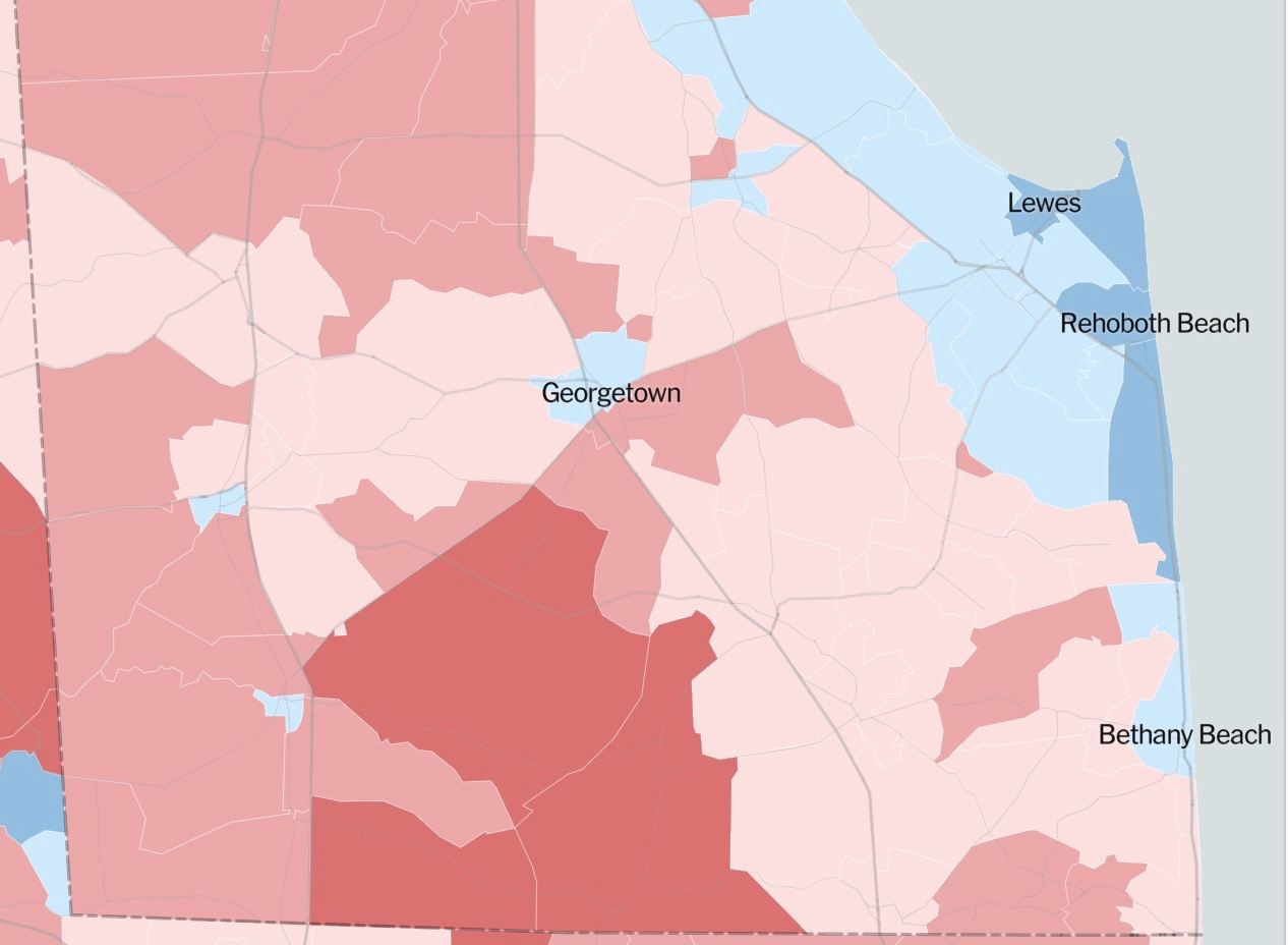
Those of you in our class last Fall will remember the data I showed about “political bubbles” revealed in 2016 presidential voting data, precinct-by-precinct. We looked at closeups of bubbles in Delaware, including coastal Sussex County. I mentioned that it would take some time for new, 2020 election data to be massaged into explorable maps like the ones from 2016.
They’re here! Well, actually about two-thirds of the national voting data has been poured into new national maps. More on that below, but first…
I think you might enjoy spending a few minutes exploring this interactive map of the 2020 election precinct-by-precinct data, created by the NY Times. You can do your own exploration here. You can enter specific zip codes and locations in the U.S. to see two views:
how the area voted in 2020
and how much change occurred between the 2016 election and the 2020 election
Here are a few examples.
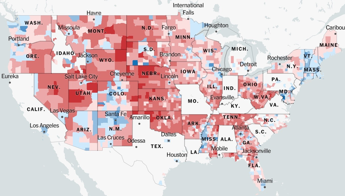
Here’s the 2020 election national vote:
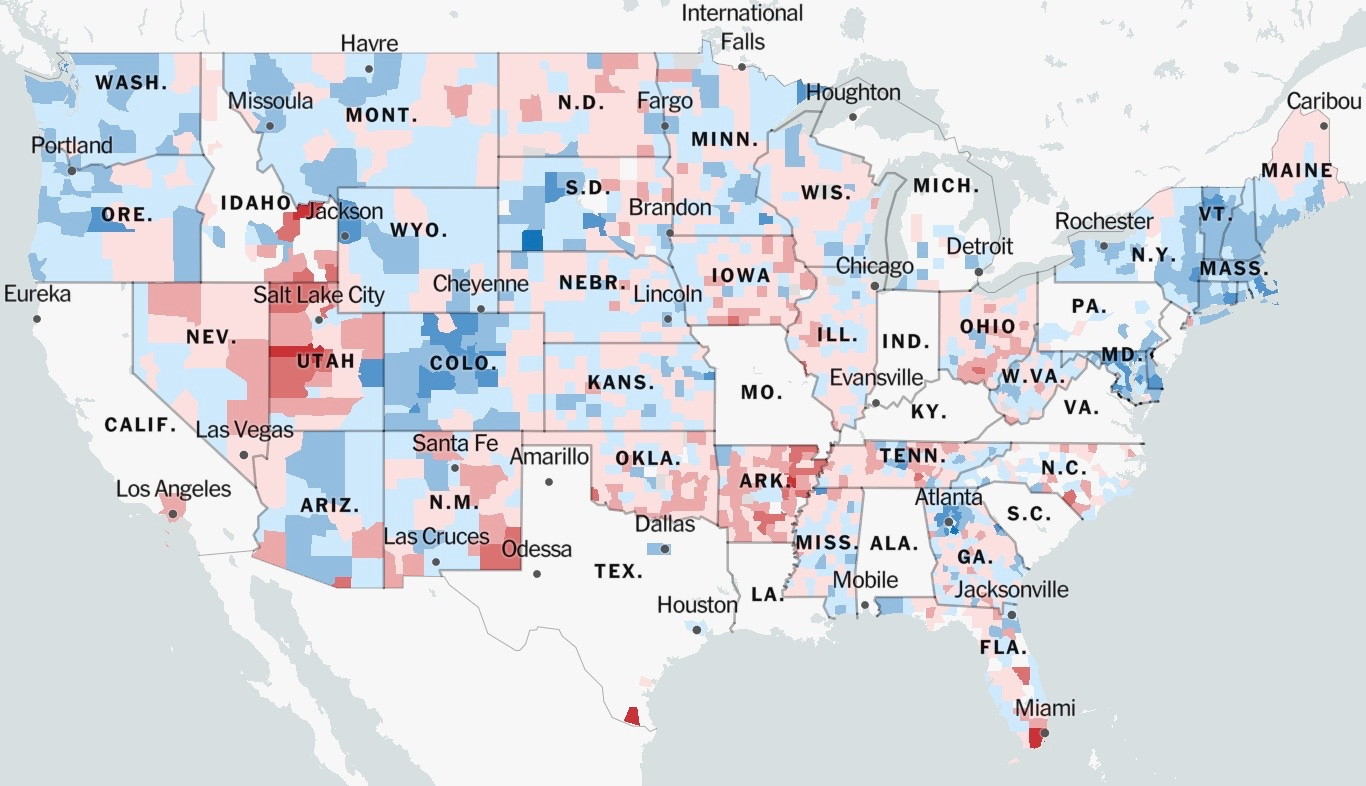
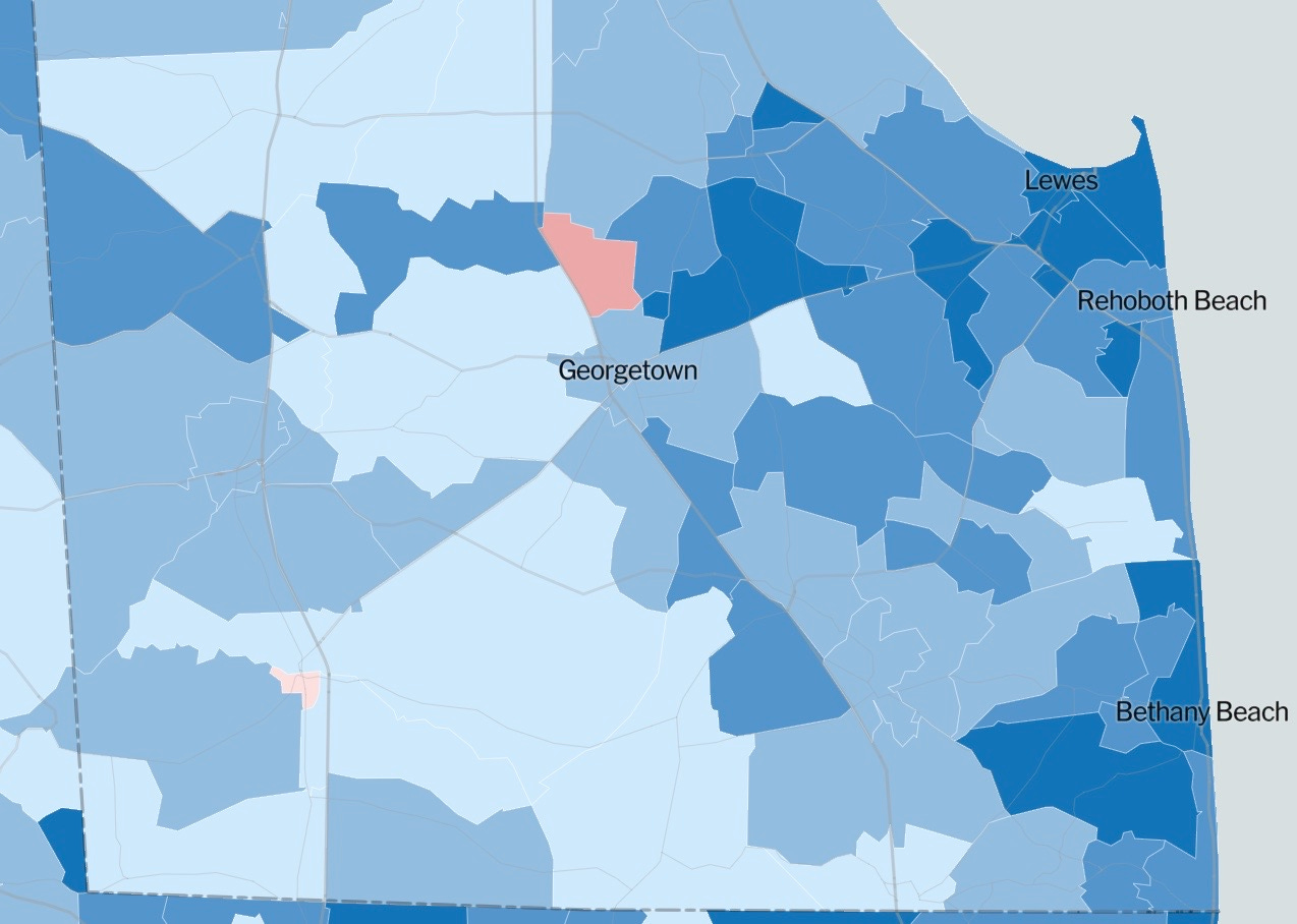
Now here’s the change between 2016 and 2020. On this map, blue indicates areas where voters in 2020 switched from Republican to Democratic votes. Red indicates where voters switched from Democratic to Republican in in 2020. Deeper colors indicate more dramatic shifts between 2016 and 2020.
Now take a look at Delaware, widely known as a “blue state” because it consistently elects Democrats to national office.
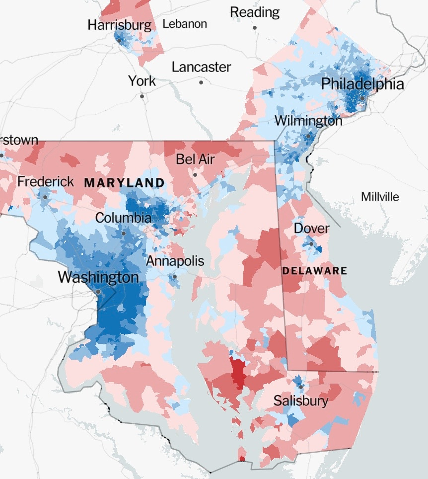
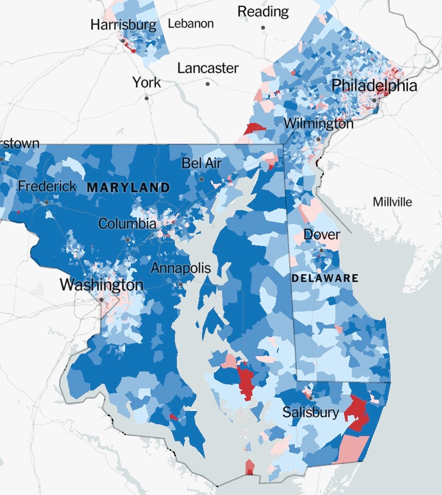
Here’s the 2020 election result, precinct-by-precinct on the Delmarva peninsula. Remember that northern Delaware includes roughly two-thirds of Delaware’s population.
Now here’s the change in voter choices between 2016 and 2020, in Delaware. It was a very dramatic shift toward the Democrats, even in the most conservative areas of Delmarva.
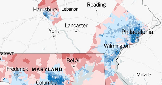
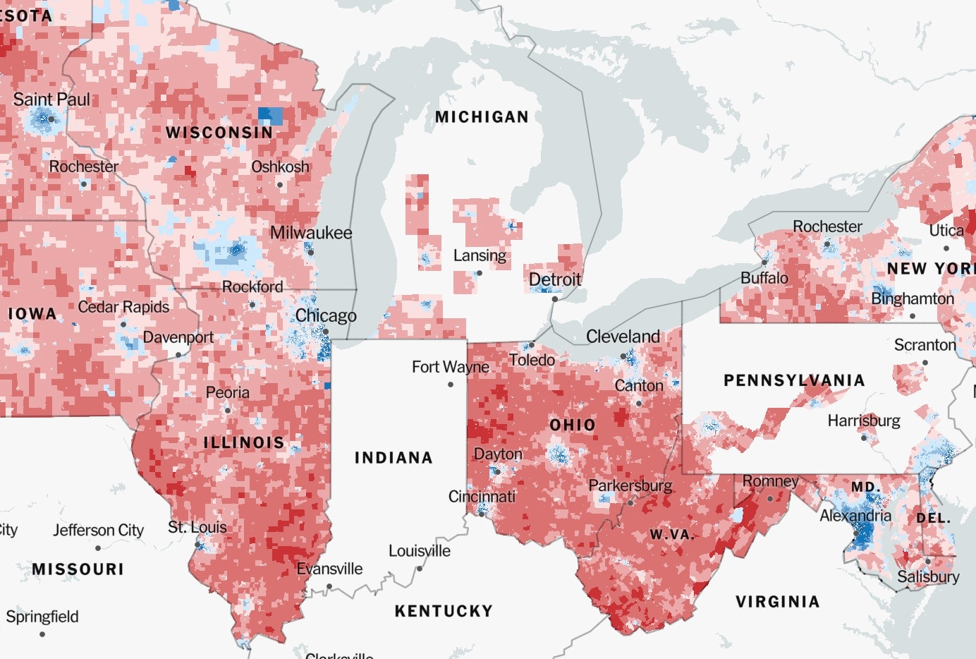
Finally, compare the swing states of the midwest, from Pennsylvania to Iowa.
The 2020 election results:
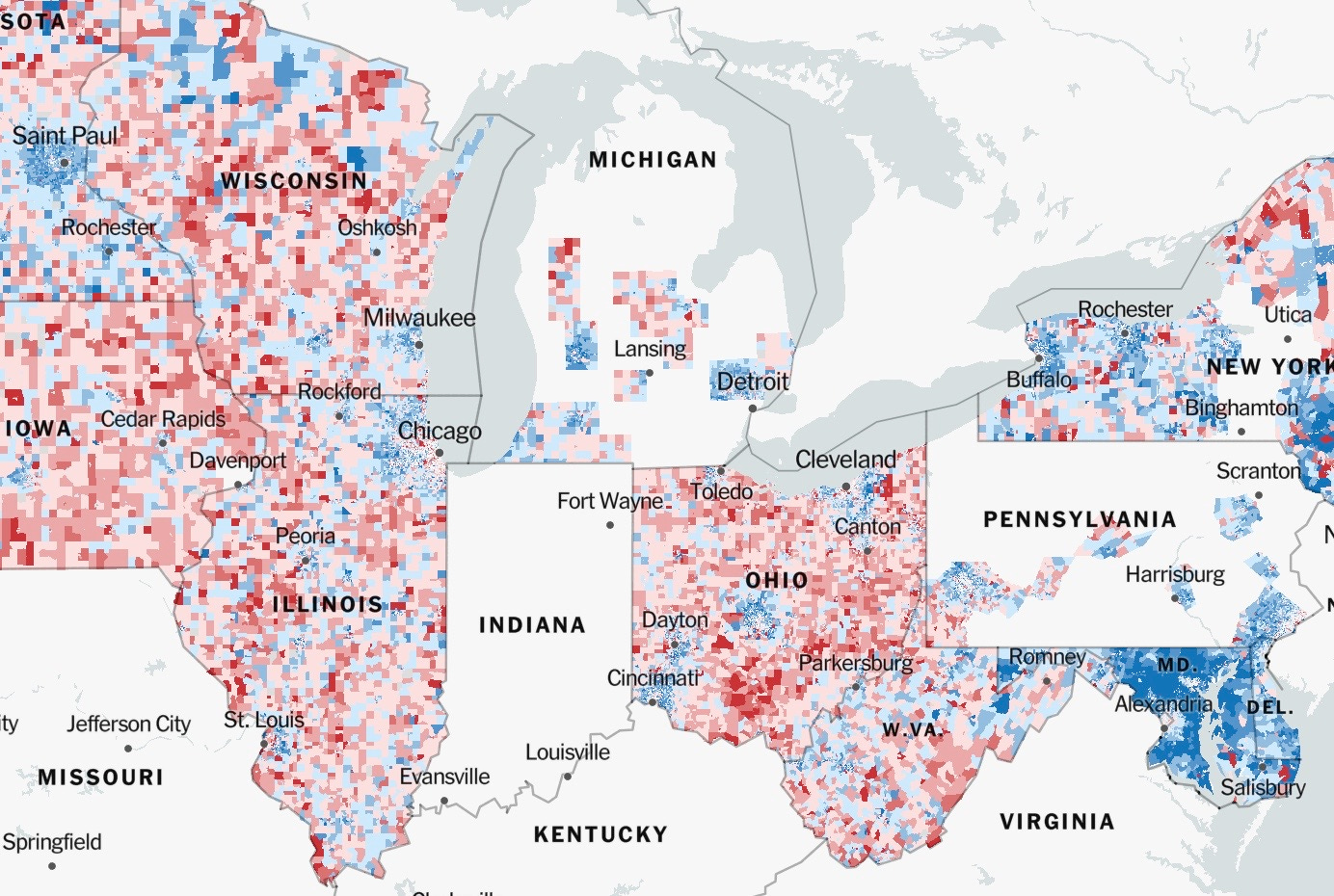
And the change in voter behavior between 2016 and 2020. It’s a much more mixed picture than Delmarva, making it easy to see why these states were cliff-hangers in 2020.
Why do some areas show no available data?
According to the Times, some states have (so far, at least) supplied voting data only at the county-by-county level, not precinct-by-precinct. To avoid mixing apples and oranges, the Times analysts chose to omit data where it’s not available at the precinct level. Eventually, I’m sure, all the data will become available for research and history.
Into the weeds
If you really want to get into the weeds of the data used in these maps, you can do so here.
The interactive map
If perusing these maps intrigues you, as it does me, click here to access the interactive map where you can zoom down to individual precincts, to see how your neighbors voted, and how the voting changed since 2016.



Fascinating! Thank you.